Dear Reader,
In case you missed it, welcome to Part 2 of Learn to Look at Art, my monthly series designed to make the study of art and a visit to a museum truly rewarding. As a reminder, the full archive of the 12-part series will be available here.
In Part 1, we looked at the idea of “training our visual awareness”.
This second instalment shifts to how paintings attract our attention and shape our manner of seeing — guiding our gaze, directing our focus, and structuring the rhythms of our experience. In other words, we move from considering the skills we bring to the act of viewing to examining the subtle strategies paintings employ to orchestrate that act.
Part 2: How Paintings Shape Our Perception
When we look at a figurative painting, a remarkable thing happens. A flat surface transfigures into a three-dimensional space and we are drawn into a picture of the world shaped by the artist’s aesthetic choices.
Naturally, this doesn’t happen by chance. Artists have developed a range of techniques for suggesting or establishing space and depth in their pictures. The technical term for a sense of depth in a picture is recession, which is most obviously achieved by employing methods of perspective like diminishing the size and detail of objects as they recede into the distance.
Among the methods of recession we find aerial perspective: the recognition that distant objects lose clarity and drift towards a bluish haze under the effects of atmosphere.

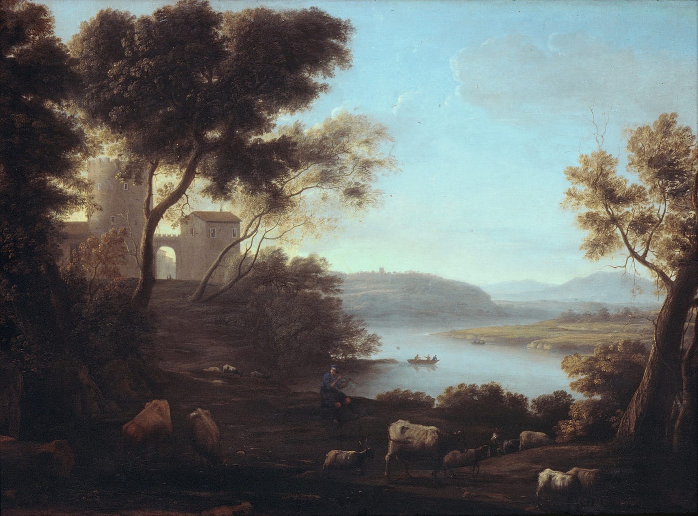
The effect can be seen in the works of the influential French painter Claude Lorrain (1604-82), whose misty dawns and fading sunsets are often bathed in an ethereal blue glow. It is a glow that does something more than convey distance: it proposes a sort of timelessness, the steady radiance of long-ago days — an effect that helped to elevate the genre of landscape to a classical ideal it had never known before.
His style of art inspired later generations of artists, especially the way he managed to imbue realistic landscapes with a poetic, idealised vision of nature scattered with antique architecture.
Claude did something else in his landscapes too: in order to create a sense of the picture opening up before the viewer, he deliberately closed parts of the image off. Look at the work shown above, Pastoral Landscape: The Roman Campagna made around 1639, and notice the plethora of rather shadowy detail in the foreground. Trees to the left and right, and in the middle a herd of grazing cattle, all heavily doused in shade. The oscillation between nearness and obscurity of these details is important, since they lead us to wonder: are these elements the main subject of the painting or are they periphery?
Looking Deeper With Light and Shade
Keep reading with a 7-day free trial
Subscribe to Discover Art History - Christopher P Jones to keep reading this post and get 7 days of free access to the full post archives.

